Liferay Fragments: Configuration
Liferay Fragments: Configuration
Overview
To more flexibility - Liferay fragments may have custom configuration options.
This article will explain how to add configuration options to fragments and how to use them on a content page.
Add Configuration Options
In a fragment editor we can define fragment configuration on the “Configuration” tab:
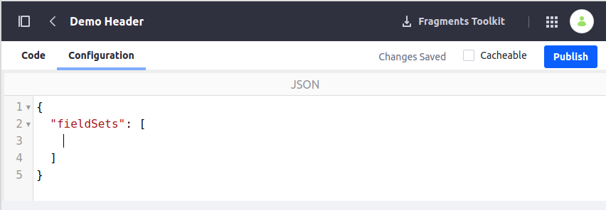
This sample adds configuration options to control the visibility of specific sections (Language and Personal Bar) in a fragment:
{
"fieldSets": [
{
"fields": [
{
"name": "showLanguage",
"label": "Show Language",
"description": "Show Language Widget",
"type": "checkbox",
"defaultValue": true
},
{
"name": "showPersonalBar",
"label": "Show Personal Bar",
"description": "Show Personal Bar Widget",
"type": "checkbox",
"defaultValue": true
}
]
}
]
}
Once configuration options are defined - we’ll see them on a page in the fragment settings:

Note: if a fragment is already added to the page - we need to propagate fragment changes in order to see the updated version.
Using Configuration Options
To make fragment configuration options functional - we need to use them in our fragment’s code.
For the sample above we can do it in this way:
[#if configuration.showLanguage]
<div class="language-wrapper">
[@liferay_portlet["runtime"] portletName="com_liferay_site_navigation_language_web_portlet_SiteNavigationLanguagePortlet"/]
</div>
[/#if]
[#if configuration.showPersonalBar]
<div class="personal-bar-wrapper">
[@liferay_portlet["runtime"] portletName="com_liferay_product_navigation_user_personal_bar_web_portlet_ProductNavigationUserPersonalBarPortlet"/]
</div>
[/#if]
This will provide us with the possibility to control the visibility of specific sections in the fragment.
Configuration Types
The following configuration type are supported:
checkbox - true/false value;
colorPalette - a tool to choose the color;
itemSelector - a selector to choose one of the content items (document/article/blog);
select - a drop-down field with specified values;
text - a text value;
videoSelector - a selector for video (from Documents & Media or a YouTube link);
collectionSelector - a selector for collection or collection provider.
References
https://learn.liferay.com/dxp/latest/en/site-building/developer-guide/developing_page_fragments.html
https://learn.liferay.com/dxp/latest/en/site-building/developer-guide/reference/fragments.html
Enjoy 😏

Comments
Post a Comment